Types of controls
The following sections introduce the types of controls you can add to a Window or other container element
(panel or group). For details of the properties and functions, and of how to create each type of element,
see Control object constructors.
Containers
These are types of Control objects which are contained in windows, and which contain and group other
controls.
Panel |
Typically used to visually organize related controls.
You can use panels as separators: those with width of 0 appear as vertical lines and those with height of 0 appear as horizontal lines: var dlg = new Window( "dialog", "Alert Box Builder" );
dlg.msgPnl = dlg.add( "panel", [ 25, 15, 355, 130 ], "Messages" );
|
Group |
Used to visually organize related controls. Unlike |
TabbedPanel |
A panel that contains only Tab objects as its immediate children. It has a selection property that contains the currently active Tab child. When the value of the selection property changes, either by a user selecting a different tab, or by a script setting the property, the TabbedPanel receives an onChange notification. The title property provides an optional label; the titleLayout property places the label within the panel. |
Tab |
A general container whose parent is a TabbedPanel, with a selectable tab showing a localizable text value. Its size and position are determined by the parent. |
User-interface controls
These are types of Control objects that are contained in windows, panels, and groups, and that provide
specific kinds of display and user interaction. Control instances are created by passing the corresponding
type keyword to the add() method of a Window or container; see Control types and creation parameters.
These examples do not set bounds explicitly on creation, because it is often more useful to set a preferred size, then allow the layout manager to set the bounds; see Automatic layout.
Image
Displays an iconic image.
The
imageproperty identifies the icon image; see Displaying images.The
titleproperty provides an optional label; the titleLayout property places the label with respect to the image.
StaticText
Typically used to display text strings that are not intended for direct manipulation by a user, such as informative messages or labels.
This example creates a Panel and adds several StaticText elements:
var dlg = new Window( "dialog", "Alert Box Builder" );
dlg.msgPnl = dlg.add( "panel", undefined, "Messages" );
dlg.msgPnl.titleSt = dlg.msgPnl.add( "statictext", undefined, "Alert box title:" );
dlg.msgPnl.msgSt = dlg.msgPnl.add( "statictext", undefined, "Alert message:" );
dlg.show();
EditText
Allows users to enter text, which is returned to the script when the dialog is dismissed. Text in EditText elements can be selected, copied, and pasted.
Set the
textproperty to assign the initial displayed text in the element, and read it to obtain the current text value, as entered or modified by the user.Set the
textselectionproperty to replace the current selection with new text, or to insert text at the cursor (insertion point). Read this property to obtain the current selection, if any.
This example adds some EditText elements, with initial values that a user can accept or replace:
var dlg = new Window( "dialog", "Alert Box Builder" );
dlg.msgPnl = dlg.add( "panel", undefined, "Messages" );
dlg.msgPnl.titleSt = dlg.msgPnl.add( "statictext", undefined, "Alert box title:" );
dlg.msgPnl.titleEt = dlg.msgPnl.add( "edittext", undefined, "Sample Alert" );
dlg.msgPnl.msgSt = dlg.msgPnl.add( "statictext", undefined, "Alert message:" );
dlg.msgPnl.msgEt = dlg.msgPnl.add( "edittext", undefined, "<your message here>", { multiline: true } );
dlg.show();
Note
the creation property on the second EditText field, where multiline: true
indicates a field in which a long text string can be entered. The text wraps to appear
as multiple lines.
Checkbox
Allows the user to set a boolean state.
Set the
textproperty to assign an identifying text string that appears next to the clickable box.The user can click to select or deselect the box, which shows a checkmark when selected. The
valueis true when it is selected (checked) and false when it is not.
When you create a Checkbox, you can set its value property to specify its initial state and appearance.
// Add a checkbox to control the buttons that dismiss an alert box
dlg.hasBtnsCb = dlg.add( "checkbox", undefined, "Should there be alert buttons?" );
dlg.hasBtnsCb.value = true;
Progressbar
Typically used to display the progress of a time-consuming operation. A colored bar
covers a percentage of the area of the control, representing the percentage
completion of the operation. The value property reflects and controls how much of
the visible area is colored, relative to the maximum value (maxvalue). By default the
range is 0 to 100, so the value = 50 when the operation is half done.
Slider
Typically used to select within a range of values. The slider is a horizontal bar with a
draggable indicator, and you can click a point on the slider bar to jump the indicator
to that location. The value property reflects and controls the position of the indicator,
within the range determined by minvalue and maxvalue. By default the range is 0 to
100, so setting value = 50 moves the indicator to the middle of the bar.
Scrollbar
Like a slider, the scrollbar is a bar with a draggable indicator. It also has “stepper”
buttons at each end, that you can click to jump the indicator by the amount in the
stepdelta property. If you click a point on the bar outside the indicator, the indicator
jumps by the amount in the jumpdelta property.
You can create scrollbars with horizontal or vertical orientation; if width is greater
than height, it is horizontal, otherwise it is vertical. Arguments to the add method
that creates the scrollbar define values for the value, minvalue and maxvalue
properties.
Scrollbars are often created with an associated EditText field to display the current
value of the scrollbar, and to allow setting the scrollbar’s position to a specific value.
This example creates a scrollbar with associated StaticText and EditText elements
within a panel:
dlg.sizePnl = dlg.add( "panel", undefined, "Dimensions" );
dlg.sizePnl.widthSt = dlg.sizePnl.add( "statictext", undefined, "Width:" );
dlg.sizePnl.widthScrl = dlg.sizePnl.add( "scrollbar", undefined, 300, 300, 800 );
dlg.sizePnl.widthEt = dlg.sizePnl.add( "edittext" );
ListBox, DropDownList and TreeView
These controls display lists of items, which are represented by ListItem objects in
the items property. You can access the items in this array using a 0-based index.
A
ListBoxcontrol displays a list of choices. When you create the object, you specify whether it allows the user to select only one or multiple items. If a list contains more items than can be displayed in the available area, a scrollbar may appear that allows the user to scroll through all the list items. A list box can display items in multiple columns; see Creating multi-column lists.A
DropDownListcontrol displays a single visible item. When you click the control, a list drops down and allows you to select one of the other items in the list. Drop-down lists can have nonselectable separator items for visually separating groups of related items, as in a menu.A
TreeViewcontrol is similar to a ListBox, except that the items can have child items. Items with children can be expanded or collapsed to show or hide the child items. Child items can in turn contain children.The
titleproperty provides an optional label; the titleLayout property places the label with respect to the list.
You can specify the choice items on creation of the list object, or afterward using the
list object’s add() method. You can remove items programmatically with the list
object’s remove() and removeAll() methods.
ListItem
Items added to or inserted into any type of list control are ListItem objects, with
properties that can be manipulated from a script. ListItem elements can be of the
following types:
|
The typical item in any type of list. It displays text or an image, and can be selected. To display an image, set the item object’s image property; Displaying images. |
|
A separator is a nonselectable visual element in a drop-down list. Although it has a text property, the value is ignored, and the item is displayed as a horizontal line. |
|
A displayable and selectable item in a |
FlashPlayer
Runs a Flash movie within a ScriptUI window. Its control’s methods allow you to load a movie from an SWF file and control the playback. See FlashPlayer control functions.
You can also use the control object to communicate with the Flash application, calling ActionScript methods, and making JavaScript methods defined in your Adobe application script available to the Flash ActionScript code. See Calling ActionScript functions from a ScriptUI script.
The title property provides an optional label; the titleLayout property places the
label with respect to the player.
Displaying images
You can display icon images in Image or IconButton controls, or display images in place of strings or in
addition to strings as the selectable items in a Listbox or DropdownList control. In each case, the image
is defined by setting the element’s image property. You can set it to a ScriptUIImage object; a named icon
resource; a File object; or the pathname of a file containing the iconic image, or of an alias or shortcut to
that file (see Specifying paths).
The image data for an icon can be in Portable Network Graphics (PNG) format, or in Joint Photographic Experts Group (JPEG) format. See http://www.libpng.org and http://www.jpeg.org/ for detailed information on these formats.
You can set or reset the image property at any time to change the image displayed in the element.
The scripting environment can define icon resources, which are available to scripts by name. To specify an
icon resource, set a control’s image property to the resource’s JavaScript name, or refer to the resource by
name when creating the control. For example, to create a button with an application-defined icon
resource:
myWin.upBtn = myWin.add ( "iconbutton", undefined, "SourceFolderIcon" );
Photoshop CC, for example, defines these icon resources:
Step1Icon
Step2Icon
Step3Icon
Step4Icon
SourceFolderIcon
DestinationFolderIcon
If a script does not explicitly set the preferredSize or size property of an element that displays a icon
image, the value of preferredSize is determined by the dimensions of the iconic image. If the size values
are explicitly set to dimensions smaller than those of the actual image graphic, the displayed image is
clipped. If they are set to dimensions larger than those of the image graphic, the displayed image is
centered in the larger space. An image is never scaled to fit the available space.
Creating multi-column lists
In list controls (ListBox, DropDownList and TreeView), a set of ListItem objects represents the individual choices in the list. Each choice can be labeled with a localizable string, an image, or both, as specified by the text and image properties of the ListItem (see Displaying images).
You can define a ListBox to have multiple columns, by specifying the numberOfColumns creation
parameter. By default, the number of columns is 1. If you specify multiple columns, you can also use the
creation parameters to specify whether headers are shown, and the header text for each column.
If you specify more than one column, each ListItem object that you add to the box specifies one selectable
row. The text and image of the ListItem object specifies the label in the first column, and the subitems
property specifies labels that appear in that row for the remaining columns.
The subitems value is an array, whose length is one less than the number of columns. That is, the first
member, ListItem.subitems[0], specifies the label in the second column. Each member specifies one
label, as a JavaScript object with two properties:
{ text : displayString , image : imageFileReference }
For example, the following fragment defines a list box with two columns, and specifies the labels in each column for the two choices:
...
// create list box with two titled columns
var list = dlg.add ('ListBox', [0, 0, 150, 75], 'asd',
{numberOfColumns: 2, showHeaders: true,
columnTitles: ['First Name', 'Last Name']});
// add an item for the first row, with the label value for the first column
var item1 = list.add ('item', 'John');
// add the label value for the second column in that row.
item1.subItems[0].text = 'Doe';
// add an item for the second row, with the text for the first column label
var item2 = list.add ('item', 'Jane');
// add the label text and image for the second column in the second row
item2.subItems[0].text = 'Doe';
item2.subItems[0].image = File ("~/Desktop/Step1.png");
...
This creates a control that looks like this:
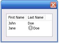
Notice that the columns have headers, and the label in the second column of the second row has both text and an image.
Prompts and alerts
Static functions on the Window class are globally available to display short messages in standard dialogs.
The host application controls the appearance of these simple dialogs, so they are consistent with other
alert and message boxes displayed by the application. You can often use these standard dialogs for simple
interactions with your users, rather than designing special-purpose dialogs of your own.
Use the static functions alert, confirm, and prompt on the Window class to invoke these dialogs with your
own messages. You do not need to create a Window object to call these functions.
Modal dialogs
A modal dialog is initially invisible. Your script invokes it using the show method, which does not return
until the dialog has been dismissed. The user can dismiss it by using a platform-specific window gesture,
or by using one of the dialog controls that you supply, typically an OK or Cancel button. The onClick
method of such a button must call the close or hide method to close the dialog. The close method
allows you to pass a value to be returned by the show method.
For an example of how to define such buttons and their behavior, see Defining behavior with event callbacks and listeners.
Creating and using modal dialogs
A dialog typically contains some controls that the user must interact with, to make selections or enter
values that your script will use. In some cases, the result of the user action is stored in the object, and you
can retrieve it after the dialog has been dismissed. For example, if the user changes the state of a Checkbox
or RadioButton, the new state is found in the control’s value property.
However, if you need to respond to a user action while the dialog is still active, you must assign the control
a callback function for the interaction event, either onClick or onChange. The callback function is the
value of the onClick or onChange property of the control.
For example, if you need to validate a value that the user enters in a edittext control, you can do so in an
onChange callback handler function for that control. The callback can perform the validation, and perhaps
display an alert to inform the user of errors.
Sometimes, a modal dialog presents choices to the user that must be correct before your script allows the
dialog to be dismissed. If your script needs to validate the state of a dialog after the user clicks OK, you can
define an onClose event handler for the dialog. This callback function is invoked whenever a window is closed.
If the function returns true, the window is closed, but if it returns false, the close operation is
cancelled and the window remains open.
Your onClose handler can examine the states of any controls in the dialog to determine their correctness,
and can show alert messages or use other modal dialogs to alert the user to any errors that must be
corrected. It can then return true to allow the dialog to be dismissed, or false to allow the user to correct
any errors.
Dismissing a modal dialog
Every modal dialog should have at least one button that the user can click to dismiss the dialog. Typically modal dialogs have an OK and a Cancel button to close the dialog with or without accepting changes that were made in it.
You can define onClick callbacks for the buttons that close the parent dialog by calling its close method.
You have the option of sending a value to the close method, which is in turn passed on to and returned
from the show method that invoked the dialog. This return value allows your script to distinguish different
closing events; for example, clicking OK can return 1, clicking Cancel can return 2. However, for this typical
behavior, you do not need to define these callbacks explicitly; see Default and cancel elements.
For some dialogs, such as a simple alert with only an OK button, you do not need to return any value. For more complex dialogs with several possible user actions, you might need to distinguish more outcomes. If you need to distinguish more than two closing states, you must define your own closing callbacks rather than relying on the default behavior.
If, by mistake, you create a modal dialog with no buttons to dismiss it, or if your dialog does have buttons,
but their onClick handlers do not function properly, a user can still dismiss the dialog by typing ESC. In this
case, the system will execute a call to the dialog’s close method, passing a value of 2. This is not, of course,
a recommended way to design your dialogs, but is provided as an escape hatch to prevent the application
from hanging in case of an error in the operations of your dialog.
Default and cancel elements
The user can typically dismiss a modal dialog by clicking an OK or Cancel button, or by typing certain
keyboard shortcuts. By convention, typing ENTER is the same as clicking OK or the default button, and
typing ESC is the same as clicking Cancel. The keyboard shortcut has the same effect as calling notify for
the associated button control.
To determine which control is notified by which keyboard shortcut, set the Dialog object’s
defaultElement and cancelElement properties. The value is the control object that should be notified
when the user types the associated keyboard shortcut.
For buttons assigned as the
defaultElement, if there is noonClickhandler associated with the button, clicking the button or typing ENTER calls the parent dialog’sclosemethod, passing a value of 1 to be returned by the show call that opened the dialog.For buttons assigned as the
cancelElement, if there is noonClickhandler associated with the button, clicking the button or typing ESC calls the parent dialog’sclosemethod, passing a value of 2 to be returned by the show call that opened the dialog.
If you do not set the defaultElement and cancelElement properties explicitly, ScriptUI tries to choose
reasonable defaults when the dialog is about to be shown for the first time. For the default element, it
looks for a button whose name or text value is "ok" (disregarding case). For the cancel element, it looks for
a button whose name or text value is "cancel" (disregarding case). Because it looks at the name value first,
this works even if the text value is localized. If there is no suitable button in the dialog, the property value
remains null, which means that the keyboard shortcut has no effect in that dialog.
To make this feature most useful, it is recommended that you always provide the name creation property
for buttons meant to be used in this way.